A color palette is a plan, and the easiest plan to test right now comes published and named: Benjamin Moore's Color Trends 2026, anchored by Color of the Year Silhouette AF-655, which the Montvale, New Jersey paint maker describes as "an alluring mix of rich espresso hues with subtle notes of charcoal" in its October 16, 2025 announcement.
What Is Silhouette AF-655, Exactly?
By the brand's own description, Silhouette AF-655 is a deep, fashion-derived neutral. The announcement casts it as "Balancing refinement and distinction," a color that "weaves a narrative of enduring style and grace, inspired by the modern take on classical suiting." On Benjamin Moore's Color of the Year page, the hue is described as one that "weaves luxurious burnt umber with delicate notes of charcoal" and "lends style and grace to the Color Trends 2026 palette of enchanting pales and handsome midtones."
In a room, read that language as evidence: burnt umber plus charcoal means the color sits between brown and black, which makes it a wall color that behaves like a shadow — kind to wood, forgiving to linen, dramatic against plaster. Hannah Yeo, senior manager of color marketing at Benjamin Moore, was quoted in the announcement framing the pick around the fashion-interiors connection, the thread the brand says ties the whole 2026 palette together.
What Are the Eight Colors in the 2026 Palette?
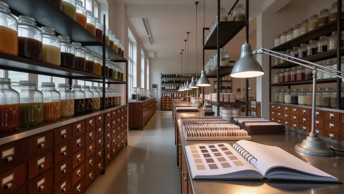
Benjamin Moore publishes the full palette alongside the announcement, and it is a ready-made scheme for anyone who wants a documented combination rather than a guess. The brand describes the palette as "Balanced between deep and delicate, traditional and poetic," usable alone or layered.
| Color | Code | Role in the palette, per Benjamin Moore's page |
|---|---|---|
| Silhouette | AF-655 | Color of the Year; deep espresso-charcoal anchor |
| Raindance | 1572 | Palette member — pale end of the spectrum |
| First Crush | CSP-310 | Palette member — soft accent among the pales |
| Swiss Coffee | OC-45 | Palette member — light neutral for trim and ceilings |
| Batik | AF-610 | Palette member — midtone |
| Narragansett Green | HC-157 | Palette member — saturated green accent |
| Southwest Pottery | 048 | Palette member — warm earthen midtone |
| Sherwood Tan | 1054 | Palette member — grounded tan |
Roles in the table follow the brand's own grouping of "enchanting pales and handsome midtones"; the precise pairings are the magazine's reading of that grouping, not Benjamin Moore's instructions.
How Do You Turn Eight Paint Names Into a Room?
Start with the anchor and work outward, and let the room's light decide the rest. A practical sequence, keeping every choice inside the documented palette:
- Pick the anchor wall or piece: Silhouette AF-655 behind shelving or a headboard, where its espresso depth can read as upholstery rather than paint.
- Set the ground with a pale: Swiss Coffee OC-45 on the remaining walls and trim gives the anchor something to push against.
- Choose one midtone for secondary furniture or a rug zone — Sherwood Tan 1054 or Batik AF-610 both stay inside the announced scheme.
- Add a single saturated note, Narragansett Green HC-157 or Southwest Pottery 048, in cushions, ceramics or one painted stool.
- Stop. Eight documented colors are a palette, not a shopping list; the brand itself presents them as usable alone or layered.
How Do You Test a Dark Palette Without Repainting Twice?
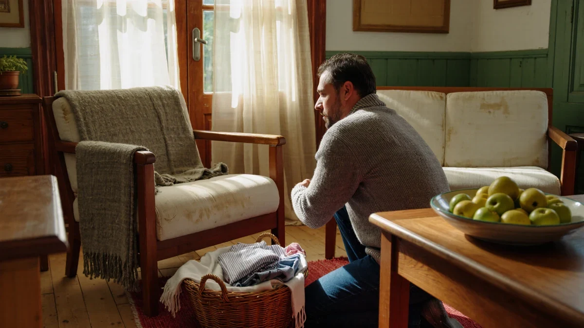
The honest method is unglamorous: large samples, watched through a day of light. Deep espresso-charcoal walls change character between morning and lamp-lit evening more than whites do, and a color described as sitting between umber and charcoal will look browner under warm bulbs and blacker under north light. Paint two adjacent test patches — one on a wall that receives direct sun, one in shade — and live with them for a weekend before committing.
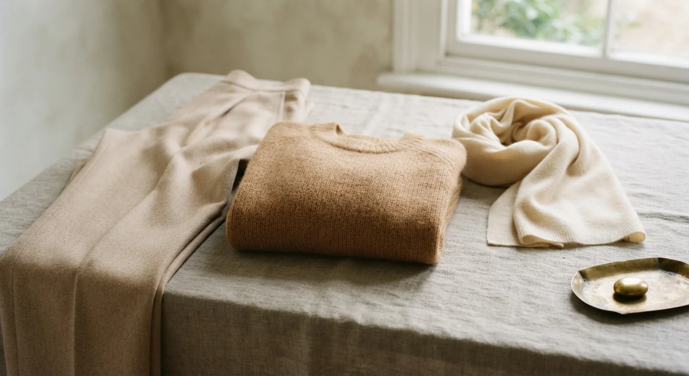
Pair the test with the materials already in the room. The brand's suiting metaphor is a useful guide here: suiting fabrics are matte, textured and quietly lustrous, which is exactly how oiled wood, bouclé and raw linen behave next to a charcoal-brown wall. Anything glossy will bounce the color around the room; matte surfaces let it settle. And because the palette is published with codes rather than mood-board approximations, a sample ordered as AF-655 today is the same formula the brand announced — a small but real advantage of building a scheme from a documented palette rather than a photograph.
Where Do Pales End and Accents Begin?
The palette's structure — espresso depth at one end, what the brand calls "enchanting pales" at the other, midtones holding the middle — maps neatly onto the three jobs a room's colors do. The pales, Raindance 1572, First Crush CSP-310 and Swiss Coffee OC-45, cover the largest surfaces: walls, ceilings, trim. The midtones, Batik AF-610, Sherwood Tan 1054 and Southwest Pottery 048, belong to the furniture layer, where upholstered pieces and case goods carry most of a room's visible area. The two saturated voices, Narragansett Green HC-157 and the anchor itself, speak least and last — a cushion, a lamp base, one painted wall.
Benjamin Moore presents the eight colors as usable "alone or layered," which is worth taking literally. A room done entirely in Silhouette AF-655 with Swiss Coffee trim is a documented, defensible scheme; so is a neutral room that carries a single Narragansett Green note. The temptation to use everything at once is real but resistible — a palette is a bench, not a starting lineup.
One practical habit keeps a layered scheme from muddying: repeat each accent at least twice, at different scales, so the eye reads intention rather than accident. A green cushion far from any other green reads as a stray; the same cushion beside a ceramic in the same family reads as a decision. The published codes make that repetition easy to execute precisely, because a sample mixed from code rather than matched by eye removes the drift that flattens a layered room.
Can a Documented Palette Work in a Rental?
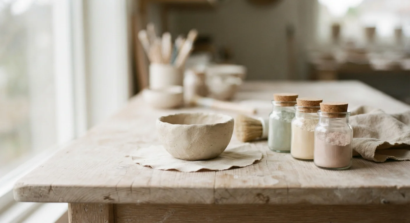
It can, and arguably works better there, because a rental constrains the surfaces a renter may paint. The standard rental permission — walls and ceilings, sometimes not even those — pushes the palette onto objects, and the eight documented colors translate cleanly. A renter can hold the anchor, Silhouette AF-655, in a single tall bookcase or a painted-backed shelving unit; carry the pales in curtains and bedding, where Swiss Coffee OC-45 and Raindance 1572 do the lightening; and let Narragansett Green HC-157 or Southwest Pottery 048 live in ceramics and cushions that move to the next apartment.
The discipline is the same as in an owned home: one anchor, one or two pales, one saturated note, repeated at two scales. What changes in a rental is the ratio — objects carry more of the scheme, so texture does the work that paint does elsewhere. Linen, bouclé and oiled wood against a white landlord wall will read the palette's warm, suit-adjacent character even without a drop of AF-655 on the architecture.