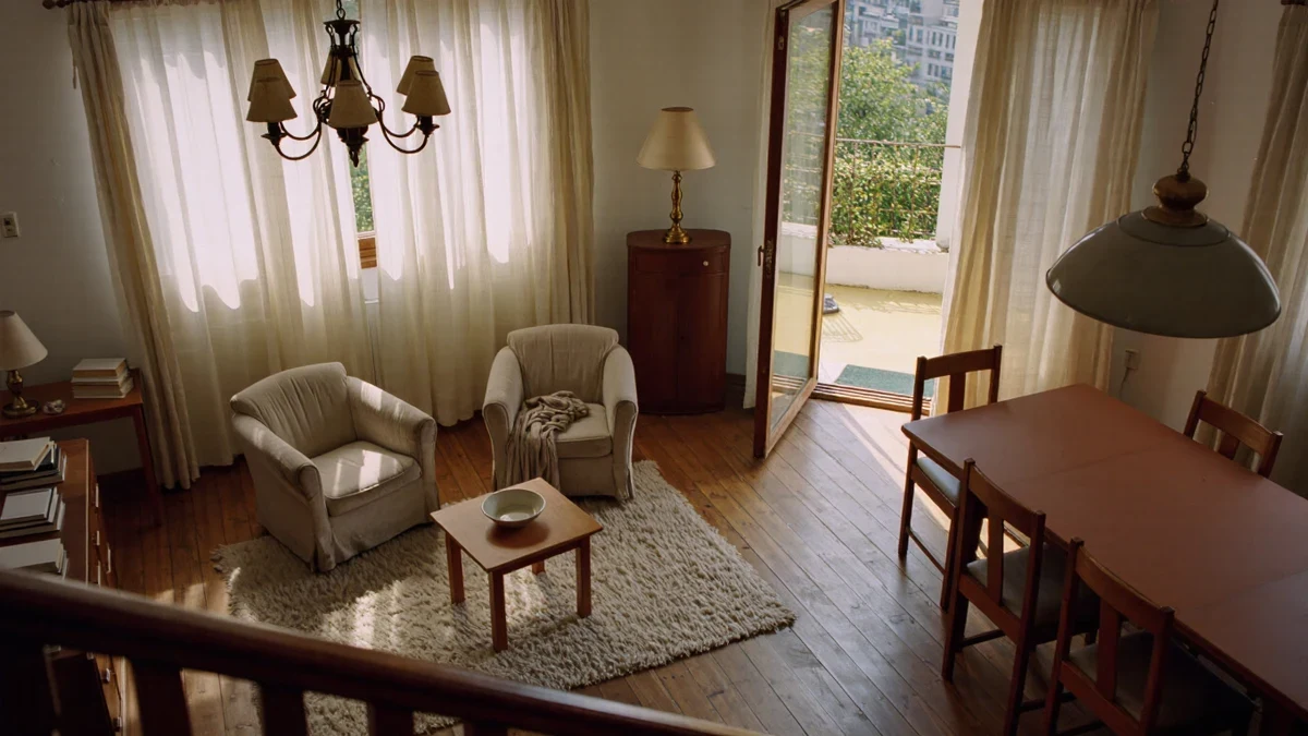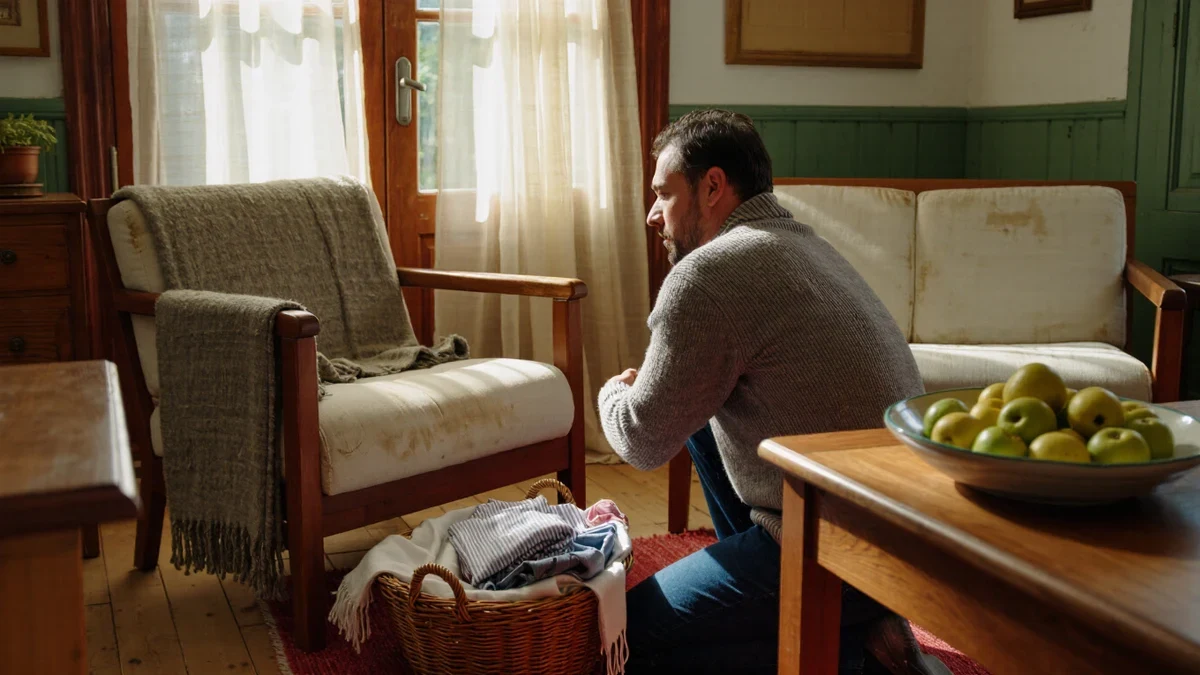
A seasonal refresh works best when it begins with one documented anchor rather than a full overhaul, and this winter that anchor is color. On October 16, 2025, Benjamin Moore named Silhouette AF-655, an espresso brown woven with charcoal notes, as its Color of the Year 2026, leading an eight-shade palette framed around detail and a return to considered classics.
What changed in the 2026 color direction?
Benjamin Moore's October 2025 announcement describes Silhouette AF-655 as an alluring mix of rich espresso hues with subtle notes of charcoal, inspired by a modern take on classical suiting. The brand's own framing is fashion-led: the connection between fashion and interiors has always been a source of inspiration, but this year in particular the suiting reference carries the palette. House Beautiful, covering the announcement, called the shade a rich espresso brown with charcoal undertones and a warm, neutral alternative to black, noting a broader shift toward warmer, classic tones.
The timing matters for a December refresh because the announcement sets the direction retailers will follow through 2026. Benjamin Moore's director of color marketing, Magno, told House Beautiful that browns are almost becoming a nice substitute for using black or charcoal because they carry a little bit of a softer warmth, and that the brand is seeing a lot of moving away from some of the microtrends and people looking for something more lasting. For a household planning one deliberate change this season, a deep warm brown is the documented direction rather than a guess.
Which colors make up the Color Trends 2026 palette?
The brand's palette page lists eight hues balanced between deep and delicate, traditional and poetic, pairing standalone shades with layering combinations across walls, built-ins, and doors.
| Color | Code | Character, per Benjamin Moore |
|---|---|---|
| Silhouette | AF-655 | Burnt umber with charcoal notes; Color of the Year 2026 |
| Raindance | 1572 | Pale, ethereal palette member |
| First Crush | CSP-310 | Soft pale for walls and layering |
| Swiss Coffee | OC-45 | The palette's white, used with every shade |
| Batik | AF-610 | Dusty pink among the enchanting pales |
| Narragansett Green | HC-157 | Blackened teal among the handsome midtones |
| Southwest Pottery | 048 | Warm midtone accent |
| Sherwood Tan | 1054 | Grounded neutral midtone |
The brand suggests pairing Silhouette with Swiss Coffee on trim and ceilings, or washing a single room in First Crush against Batik built-ins, combinations documented on its product pages rather than improvised here.
How do you refresh a room for winter without renovating?
A refresh is a sequencing problem: change the lightest, cheapest layers first and stop when the room feels right. The steps below are all non-structural and reversible, suitable for rented and owned homes alike.
- Re-cover the soft layers first: swap lightweight summer throws and linen cushions for heavier weave blankets and velvet or bouclé covers, keeping one warm neutral plus a single saturated accent drawn from the palette above.
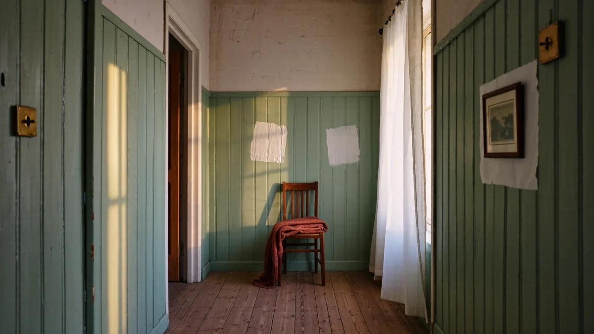
- Repaint one surface, not the room: a single wall in Silhouette, or built-ins in Narragansett Green against Swiss Coffee walls, delivers the documented direction at a fraction of the paint and labor.
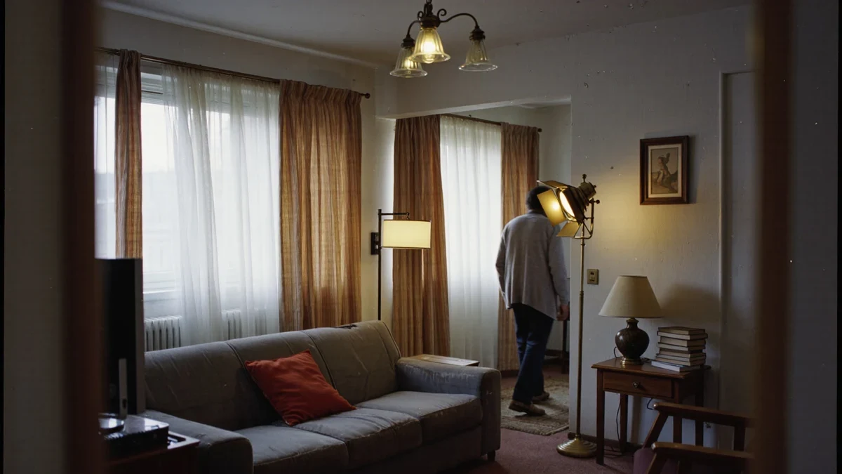
- Rearrange before adding anything: pull the sofa off the wall, float a chair, and angle the largest piece toward the window so the winter light does the decorating.
- Rotate, don't restock: bring the dark ceramics, heavier curtains, and lampshades stored since spring back into circulation, and box the pale summer equivalents in their place.
- Layer the light: add one warm-bulb lamp at seated eye level for the short afternoons, since overhead light alone flattens both the new color and the old furniture.
How do you keep a deep brown from feeling heavy?
The palette's own structure is the answer: Benjamin Moore positions its deep shade against pales and midtones rather than in isolation. In practice that means pairing a Silhouette wall or brown upholstered piece with Swiss Coffee trim, a dusty pink like Batik in textiles, and aged-brass or blackened-teal accents, so the brown reads as depth rather than darkness. House Beautiful's coverage makes the same point from the fashion side: a brown used the way a tailored suit uses charcoal, as a grounding neutral with warmth, rather than as a stunt wall.
Homes with little winter daylight should bias the ratio further toward the pales and let the espresso appear in furniture, lamp bases, and one strong textile, a reversal that costs nothing and can be re-balanced in spring. The refresh, done this way, is not a renovation deferred but a rotation practiced, with the paint can as the only real commitment.
How do you refresh a bedroom for winter?
Bedrooms reward the quietest version of the refresh, because the room is experienced horizontally and half-asleep. Weight comes first: a heavier duvet or a woven blanket folded at the foot of the bed changes the room's temperature reading more than any accessory can. Color follows the same documented palette, a Batik pillowcase against Swiss Coffee sheets, or a First Crush throw, so the bedroom participates in the season without its own repaint.
Light is the second lever. A single bedside lamp with a warm bulb, placed so it can be reached without sitting up, replaces the overhead fixture as the room's evening default; the same logic that layers lamp light in a living room applies doubly at one-third the ceiling height. Curtains gain an insulating interlining or a heavier weave in the espresso or tan tones of the palette, which reads as depth in daylight and holds warmth at night. Nothing here requires trades, tools beyond a screwdriver, or anything that a tenant could not reverse in an afternoon.
What about the entryway, the smallest refresh of all?
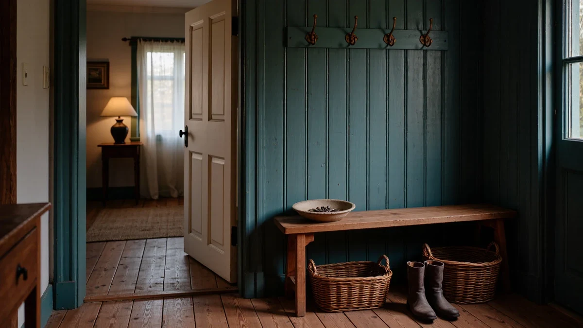
The entryway is the season's front page, and it is the cheapest room to change. A doormat in a deep tone, one basket for gloves and scarves where summer's straw tray stood, and a lamp or candle on the console reset the arrival experience for the cost of a single accessory. If one piece of the new palette is bought for the whole house, the entry is where it earns its keep, seen on every pass and setting the register for the rooms beyond. The documented direction, warm browns used the way black used to be, works at every price point: a repaint, a recovered cushion, or nothing more than what the storage boxes from last winter already hold.
A last habit keeps the whole system honest: refresh once per season rather than continuously. One deliberate afternoon in December, one in March, lets the changes register as events instead of accumulating invisibly, and it gives each rotation a moment of evaluation, what worked, what was never touched, what the room actually missed. The documented color direction changes annually; the discipline of the rotation is what makes a home fluent in responding to it, one wall, one throw, one lamp at a time, with the paint roller as the only tool that requires masking tape.