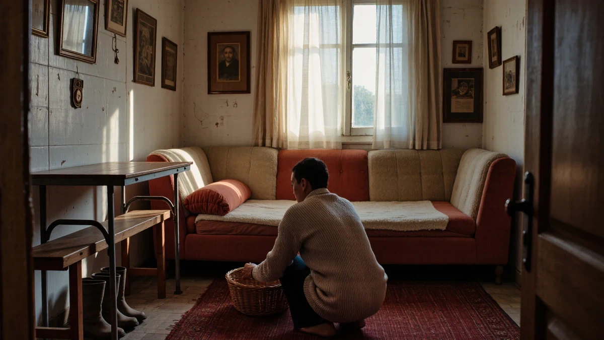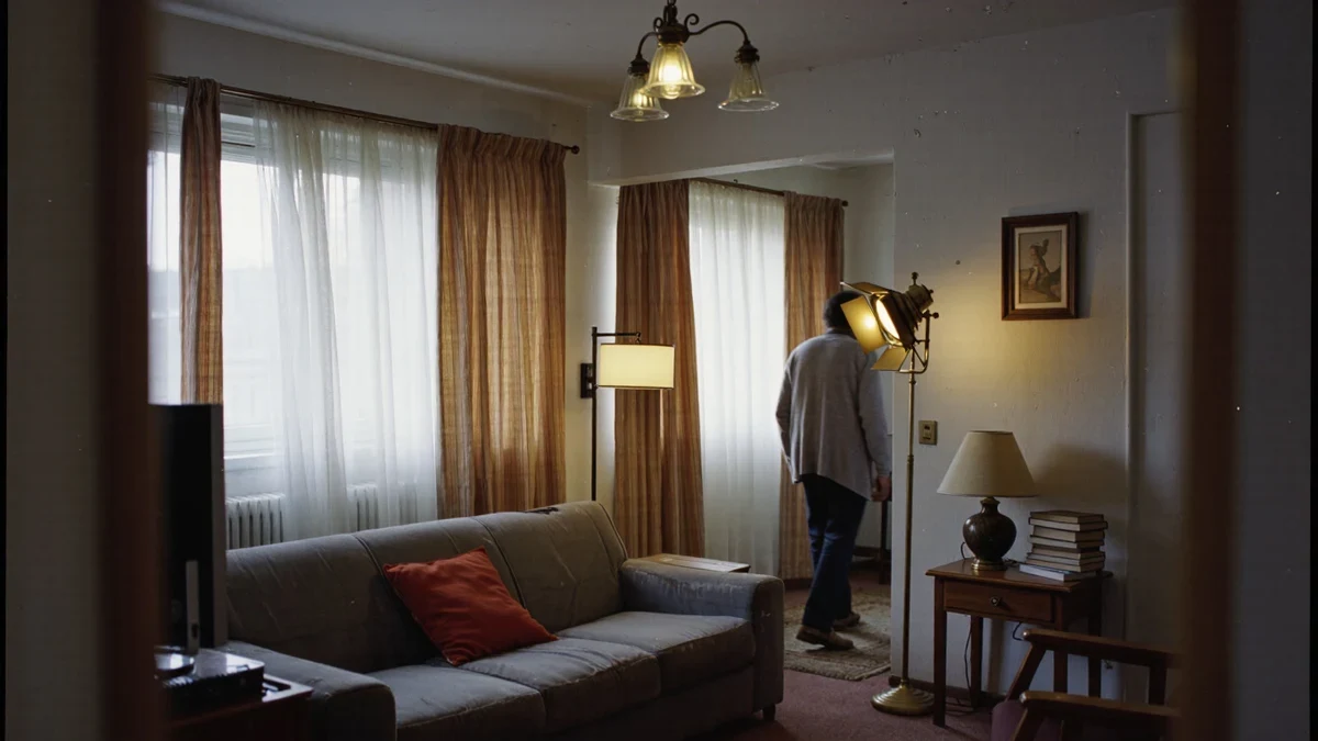
A good layout is a circulation plan before it is a furniture plan. Real Homes' design editors put movement first, asking how people will move in, out and within a space before deciding where any furniture goes, and the same guide recommends building the arrangement from the centre of the room outward rather than pushing every piece against the walls.
Where do you start a room layout?
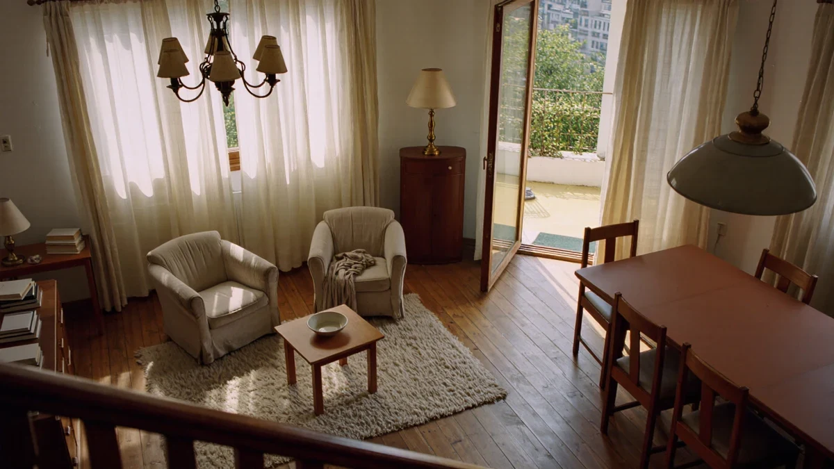
Real Homes' living room layout guide starts with use, not with the room's shape: how a household wants to use the living room will dictate what its focal point will be, and in most homes the layout is usually dictated by where the TV is placed, a fact worth questioning before it is obeyed. The guide's opening questions are practical ones, how will people move in, out and within the space, because the answers decide where it is best to place the furniture. A room planned this way begins with paths and destinations: the route from door to window, the conversation group around the focal point, and the gap between them.
The counterintuitive instruction comes next. Rather than anchoring everything to the walls, the guide advises readers to build the layout from the centre to make the room feel more intimate and welcoming, noting that wall-pushing actually just creates an empty space in the middle and leaves the room feeling off-balance. A floated chair and a side table do more for a room than a sofa bolted to the skirting board.
How much space does a room need to feel right?
The honest answer, absent from no serious guide, is measured in movement rather than inches: Real Homes' roundup of small-room layout mistakes puts it as a test anyone can run, you should be able to walk through the space without dodging your furniture. If a pathway requires a sideways shuffle past a coffee table, the layout has failed before any styling question arises. The same roundup softens the float-everything rule for real homes: anchor the sofa or credenza against a wall if that is what the room wants, but float a chair, and maybe a side table, so the eye and the body both get variety. Scale is the twin of clearance; choosing pieces that fit the scale of the room matters because bulky furniture creates congestion no arrangement can hide, and going vertical with tall bookcases uses wall height that spreading out horizontally ignores.
How do you zone an open-plan room?
Open plans fail when they are arranged as one large room rather than several small ones. Real Homes documents the toolkit: create rooms within rooms with clever furnishings, such as open shelving acting as a barrier between work and play; use room divider ideas, which the guide calls a really affordable option to zone a living room layout and which can be folded away when not in use; and lay a statement rug as an effective way to zone dedicated areas in a room that serves various purposes. Symmetry earns its place in formal rooms and small ones alike, where furniture needs room to breathe to avoid a cluttered feeling.
| Documented layout move | What it does | Where it works best |
|---|---|---|
| Build from the centre | Avoids the empty middle wall-pushing creates | Small and mid-size living rooms |
| Float one chair and a side table | Adds intimacy while keeping anchor pieces grounded | Rooms with one long wall |
| Open shelving as a divider | Separates work and leisure zones without blocking light | Open-plan living and work spaces |
| Statement rug under a seating group | Marks a zone in a multi-use room | Open plans serving several functions |
| Vertical storage | Uses height instead of floor area | Small rooms with unused wall space |
What is a workable order of operations?
- Write down what the room must hold: conversation, television, reading, dining, work, in priority order.
- Mark the fixed constraints: doors that swing, windows, radiators, and the paths between them.
- Choose the focal point the household's actual use dictates, and face the main seating toward it.
- Place the largest piece next, slightly off-centre if the room allows, then group smaller seating within conversation distance.
- Walk the room before styling anything: every path should run straight, and no route should dodge furniture.
- Only then layer rugs, lighting, and vertical storage to zone and warm what the arrangement has created.
How do you lay out a long, narrow room?
Narrow rooms break the default advice, and the documented rules still hold if they are turned ninety degrees. With little width to spare, the walk-through test governs everything: one clear path along the room's long axis, furniture grouped at the ends or along one side rather than facing across the narrow gap. The centre-first principle survives in miniature, a floated chair angled near the room's middle claims the dead zone that wall-pushing would create, while the anchor pieces stay grounded. Vertical storage earns its keep twice over here, using the tall walls the floor plan wastes, and a runner rug laid along the path makes the circulation legible rather than accidental. Where a narrow room must serve two uses, the divider toolkit applies: open shelving across the short axis marks the zones without stealing the light a solid wall would.
How does lighting finish a layout?
Flow is judged at night as often as by day, and an arrangement that passes the walk-through test in daylight can still fail after dark if the only source is a ceiling fixture. The layered approach follows the plan: a lamp beside the main seating for reading, a second at the room's other zone, and a final low light on the vertical storage or a picture to stop the room's edges from falling into darkness. Each seating group deserves its own source at seated eye level, both because faces and books need it and because pools of light are what make zones readable in an open plan. None of it is rewiring, table and floor lamps on existing outlets, positioned where the circulation plan already leaves standing room.
What are the mistakes worth checking tonight?
Three failures account for most awkward rooms, and all three are documented rather than folkloric. First, the wall-hugging arrangement that strands an empty centre and leaves the room off-balance. Second, furniture at the wrong scale, bulky pieces in tight rooms that turn every path into a dodge. Third, wasted vertical space, wall height left bare while the floor congests. The remedy for each is positional, not financial: pull one piece off the wall, swap an oversized armchair for a slimmer one from elsewhere in the home, and move a bookcase's load upward. A room that passes the walk-through test, furniture that can be passed without dodging, is already most of the way to looking composed, because flow and apparent order turn out to be the same thing seen from two directions.